1. Change main color
Now we are using Theme Provider based on https://callstack.github.io/react-native-paper/theming.html
-
We can defind the custom theme
const CustomDarkTheme = { ...DarkTheme, colors: { ...DarkTheme.colors, subtitle: Colors.grey50 } }; -
After that apply to theme props in PaperProvider
<PaperProvider theme={CustomDarkTheme}>
2. Using the XS Component
Now we have 2 ReactXS Components which is XSCard and XSTab
-
XSCard
Props
type: "default" || "expand" || "cover"
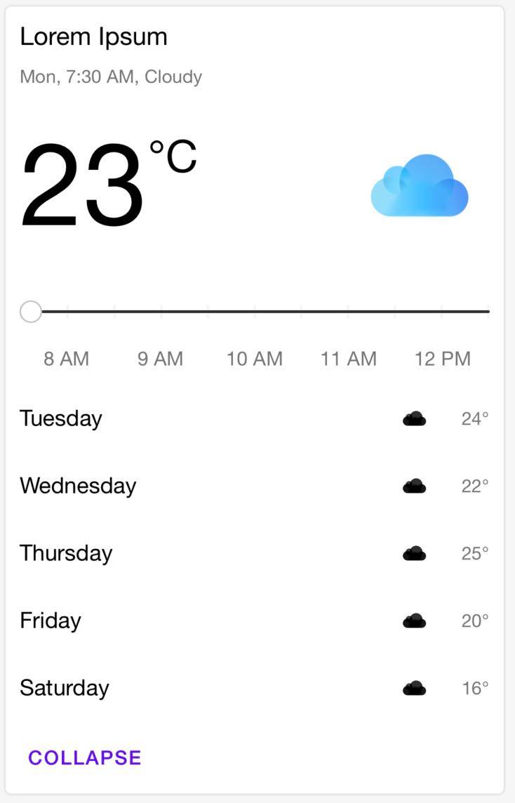
XSCard have 3 types
Examples:
type: "default"

type: "expand"

handle press card
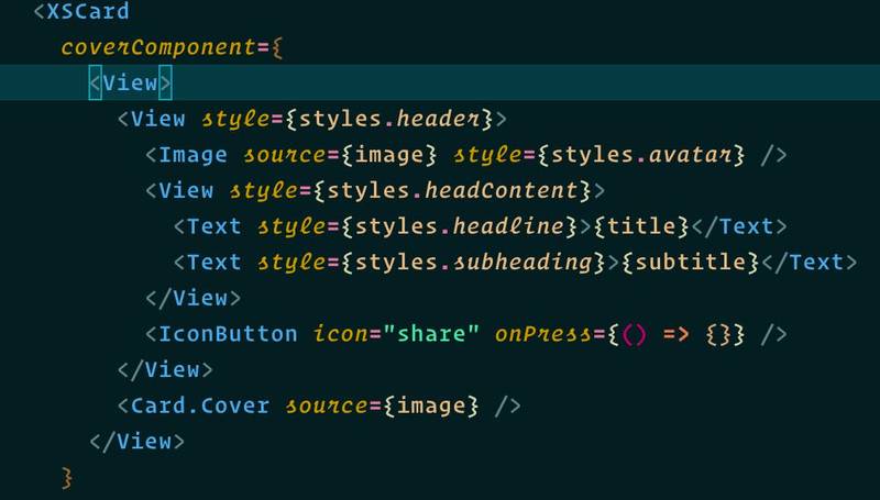
coverComponent: React Native Component
Top card component
Examples:

contentComponent: React Native Component
Content card component
Examples:

actionComponent: React Native Component
Bottom card component
Examples:

title: String || React Native Component
title render in content section
subtitle: String || React Native Component
subtitle render in content section and below
titledescription: String || React Native Component
subtitle render in content section and below
subtitleimage: image uri || require path
image located in top card
containerStyle: any
style of card component
contentContainerStyle: any
style of content container is included
title,subtitle, anddescriptioncomponentcontentStyle: any
including
title, andsubtitleimageStyle: any
style of top component
titleStyle: any
style of title
subtitleStyle: any
style of subtitle
descriptionStyle: any
style of description
theme: object
theme properties provide by Theme Provider
-
XSTab
Props
selectedIndex: number
current index tab selected
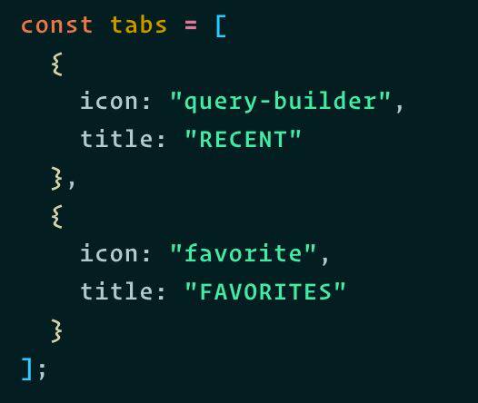
tabs: Array (required)
data to render tab
Examples:

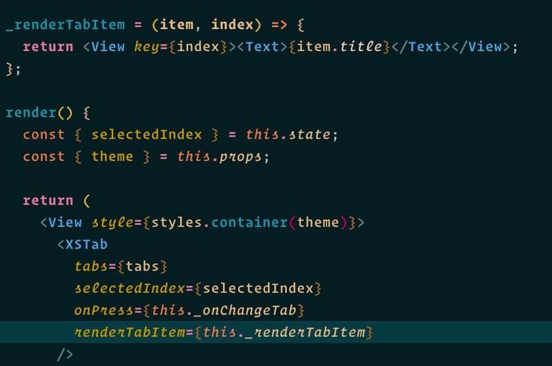
renderTabItem: Function[Object, index]
Based on
tabsprops to render tab component return item params and index tabExamples:

theme: object
theme properties provide by Theme Provider
